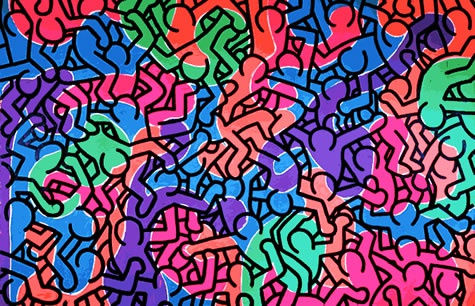
The Palette of Expression
Colour is one of the most potent tools in an artist's arsenal, and Keith Haring understood this intuitively. His artworks are a riot of colours, a symphony of shades that dance across the canvas with uninhibited exuberance. Haring's choice of colours was never arbitrary; each hue carried a specific meaning and contributed to the narrative of his pieces.
Primary Colours
Haring often employed primary colours, such as red, blue, and yellow, to create a sense of boldness and clarity in his artworks. These colours are unapologetic and direct, mirroring the straightforwardness of his messages. For instance, in "Untitled (1982)," Haring used primary colours to depict a radiant child, symbolising the purity of innocence and the universality of his message.
Radiant Color
The use of radiant and fluorescent colours was a hallmark of Haring's style. These colours not only added a sense of urgency and excitement to his works but also represented the vibrant energy of urban life. "Radiant Baby," one of his most iconic motifs, exemplifies this vivid use of colour. The radiant lines emanating from the baby signify the inherent energy and potential within every individual.
“Red is one of the strongest colors, it's blood, it has a power with the eye. That's why traffic lights are red I guess, and stop signs as well... In fact I use red in all of my paintings.”
Contrasting Colours
Haring frequently paired contrasting colours to create visual tension and draw attention to specific elements within his compositions. By juxtaposing complementary colours like red and green or blue and orange, he achieved a dynamic visual balance. In "Pop Shop IV," contrasting colours are used to create a striking sense of movement and vitality.
Black and White
Although Haring was known for his vivid colour palettes, he also utilised black and white to make powerful statements. The stark contrast between these two colours was often employed to emphasise the dualities and struggles present in society. In "Crack Down" (1986), Haring used black and white to depict the harrowing consequences of drug addiction, conveying a message of stark reality.
The Dance of Movement
Movement is an integral aspect of Keith Haring's artworks. His lines and forms seem to pulsate with life, creating a sense of perpetual motion. This dynamic quality in his art not only adds a layer of visual excitement but also serves as a metaphor for the ever-changing nature of life and society.
Continuous Line
Haring's use of a continuous line in his work is emblematic of his commitment to conveying messages of unity and interconnectedness. His figures are often connected by a single unbroken line, suggesting the interdependence of humanity. In "Radiant Madonna" (1982), the use of continuous lines accentuates Madonna's radiant and nurturing presence.
Figures in Motion
Haring's iconic figures are rarely static. They twist, turn, and contort, giving the impression that they are in a perpetual state of motion. This dynamic quality reflects the fast-paced nature of urban life and the constant flux of society. In "Untitled (Dancing Dog)" (1986), Haring's dancing dog embodies the spirit of movement and joy.
Street Art Origins
Haring's roots in street art played a significant role in his incorporation of movement into his work. The ephemeral nature of street art necessitates that it engages viewers quickly and decisively. Haring's art, born on the subway platforms and city streets of New York, had to grab the attention of passersby and communicate its message swiftly. This innate dynamism is evident in works like "Untitled (Subway Drawing)" (1985).
Dance as Protest
Dance was a recurring motif in Haring's work, symbolising liberation and protest. In "Untitled (Free South Africa)" (1985), Haring used dancing figures to express his solidarity with the anti-apartheid movement. The joyous and energetic movements of the figures served as a powerful statement against oppression.
Social and Political Commentary through Color and Movement
Beyond their aesthetic appeal, Keith Haring's use of colour and movement was deeply intertwined with his social and political activism. His art was a platform for addressing critical issues and challenging societal norms. Let's delve into a few examples of how Haring's use of colour and movement served as a means of social commentary:
AIDS Awareness
Haring was a prominent advocate for AIDS awareness and activism. His use of the colour red, often associated with love and passion, took on a new significance in the context of the AIDS epidemic. In works like "Ignorance = Fear / Silence = Death" (1989), the vibrant red figures underscored the urgency of addressing the crisis.
Anti-Apartheid
Haring's commitment to social justice extended to his art. In "Untitled (Free South Africa)" (1985), his choice of bright and dancing figures expressed his hope for a liberated South Africa. The movement in the artwork conveyed a sense of collective determination and resilience.
Anti-Drug Campaign
Haring's use of stark black and white in "Crack Down" (1986) symbolised the harsh realities of drug addiction. The anguished and contorted figures depicted the destructive force of substance abuse, urging viewers to confront this issue.
Keith Haring's art is a testament to the power of colour and movement in conveying profound messages. His use of vibrant palettes and dynamic forms not only engages viewers on a visceral level but also serves as a vehicle for social and political commentary. Haring's ability to infuse his artworks with life and energy continues to inspire and challenge us, reminding us of the enduring impact of art that speaks to both the eyes and the soul.
Explore our collection of original Keith Haring art for sale and contact Andipa Gallery via sales@andipa.com or call +44 (0)20 7581 1244.